Project Overview
My Role
Problem Statement
Project Page
Chrome Extension
Landing Page
Design
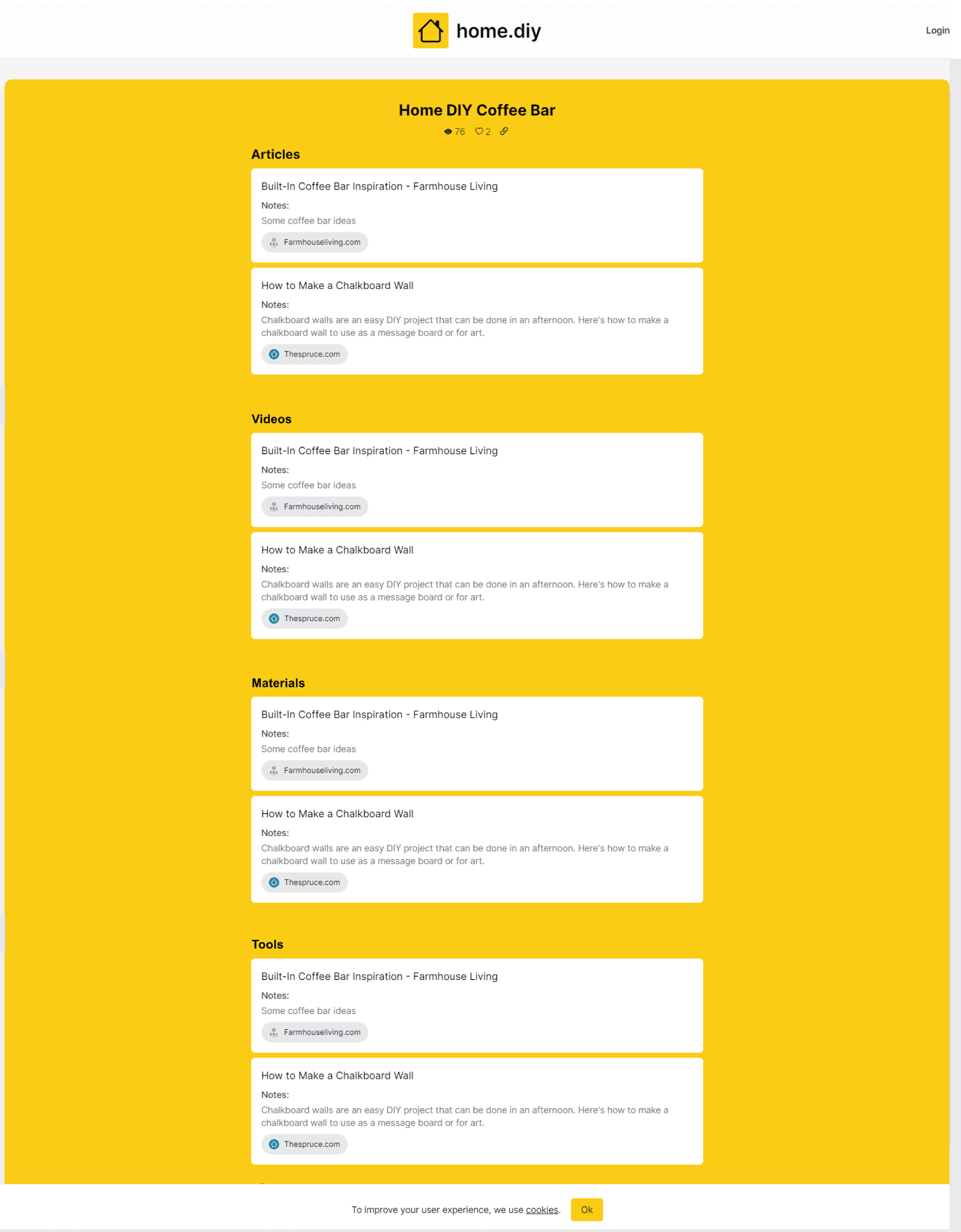
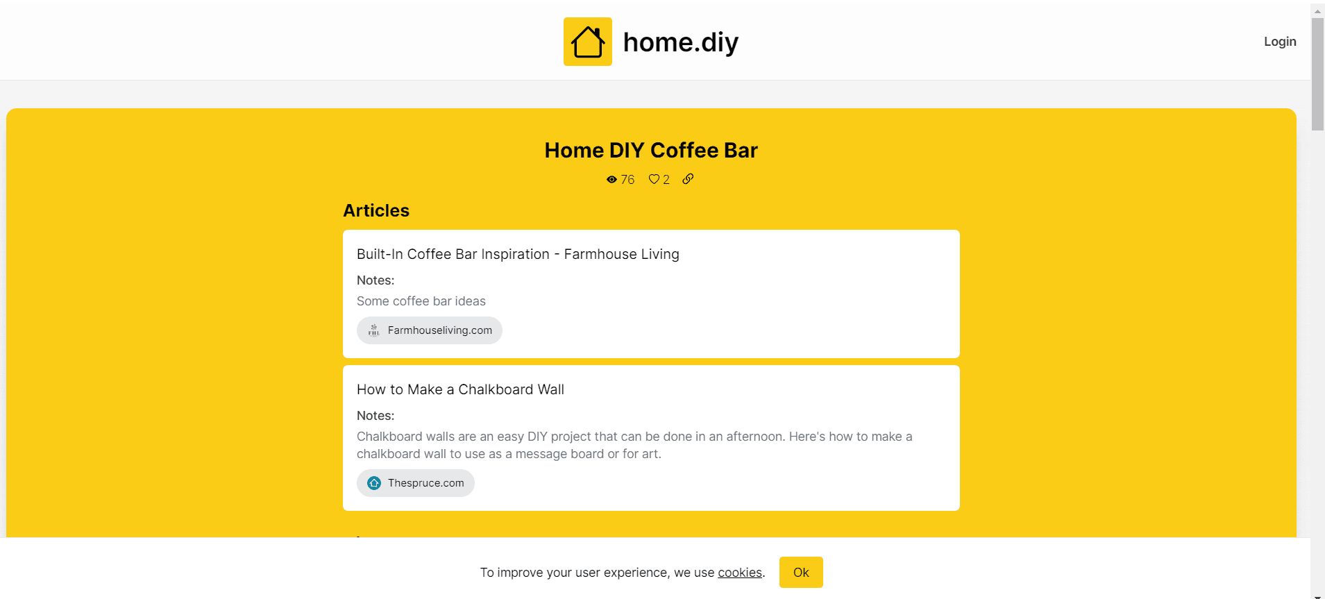
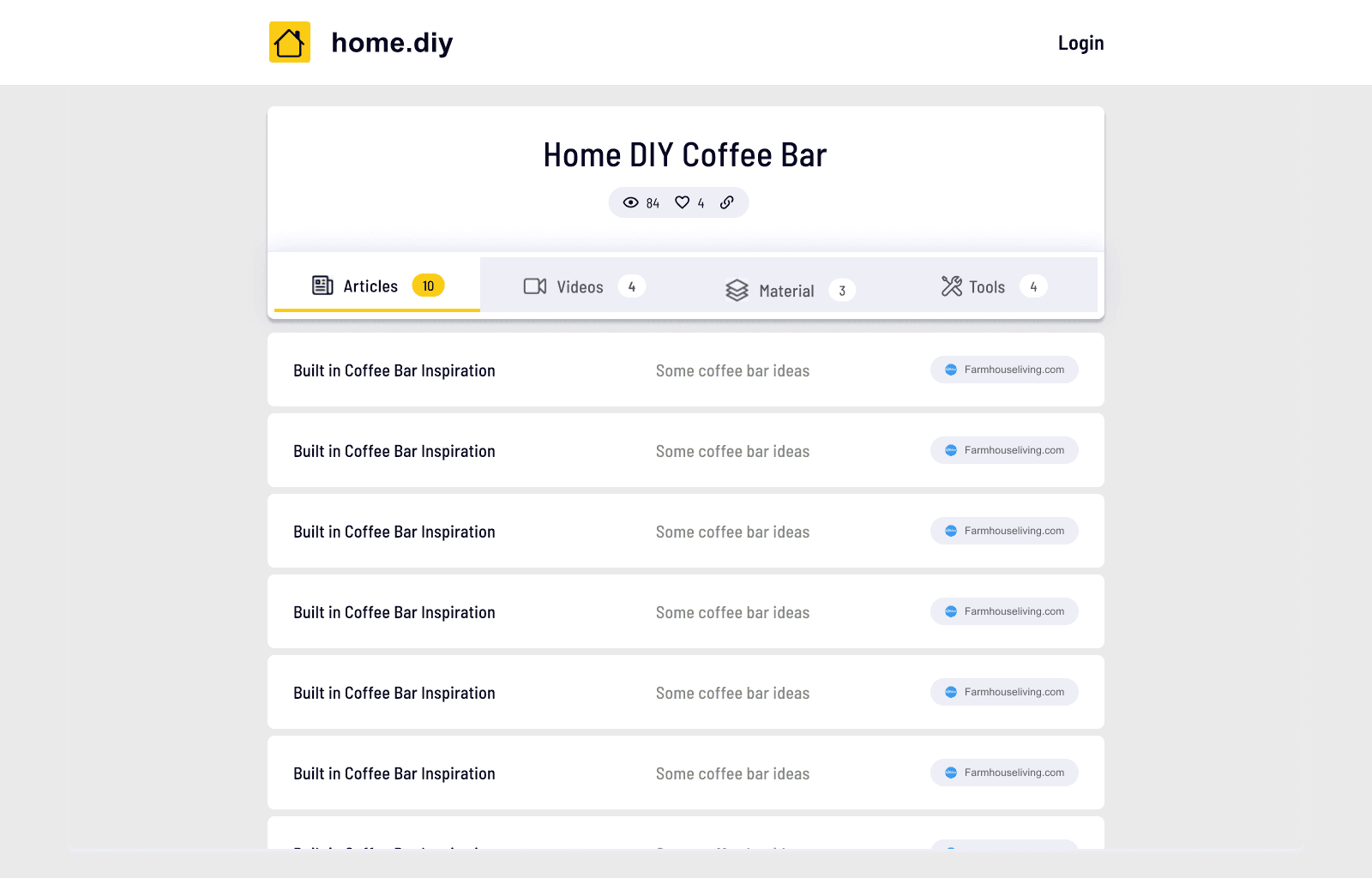
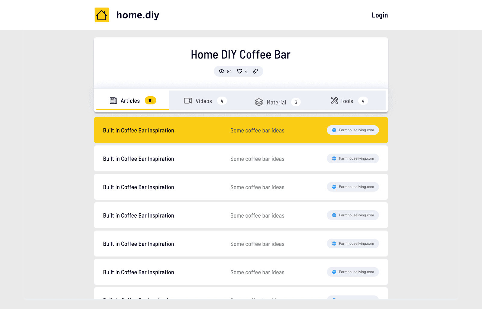
Project Page
Full page view
Viewport
Color Contrast and Readability
New Design
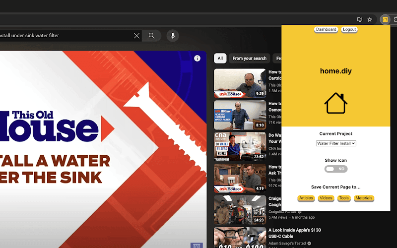
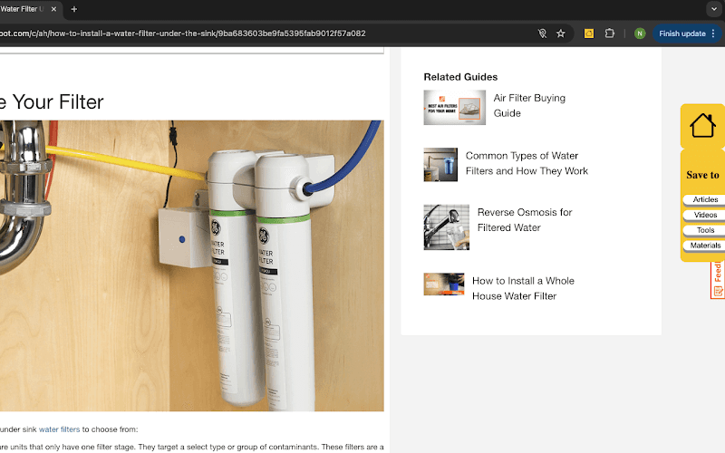
Chrome Extensions
This is an extension that lets you save any webpage you are browsing for your DIY project on the home.diy dashboard. So were looking for a cleaner and more aesthetic design.
Before Design
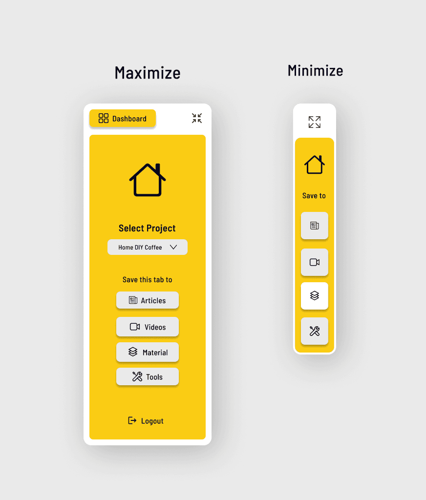
Maximize Version
Minimize Version
Web Design
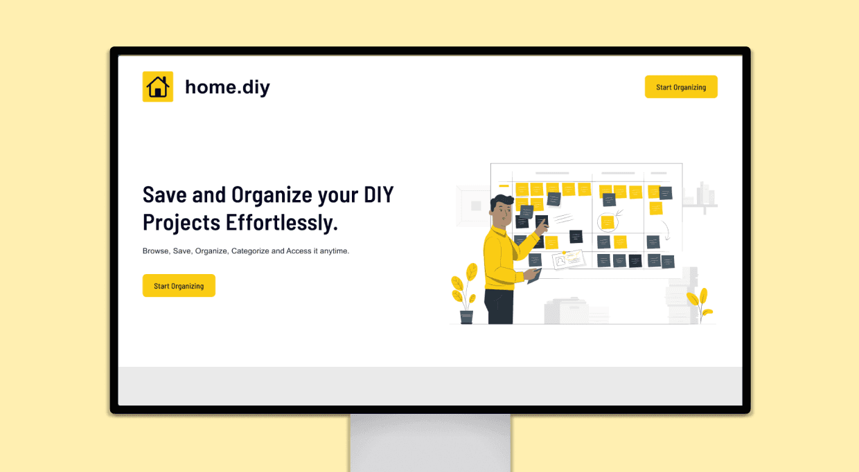
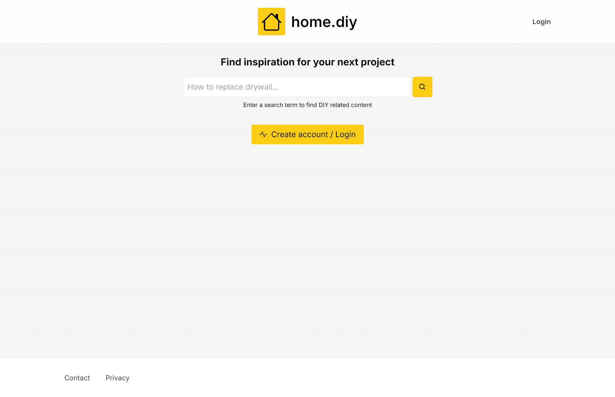
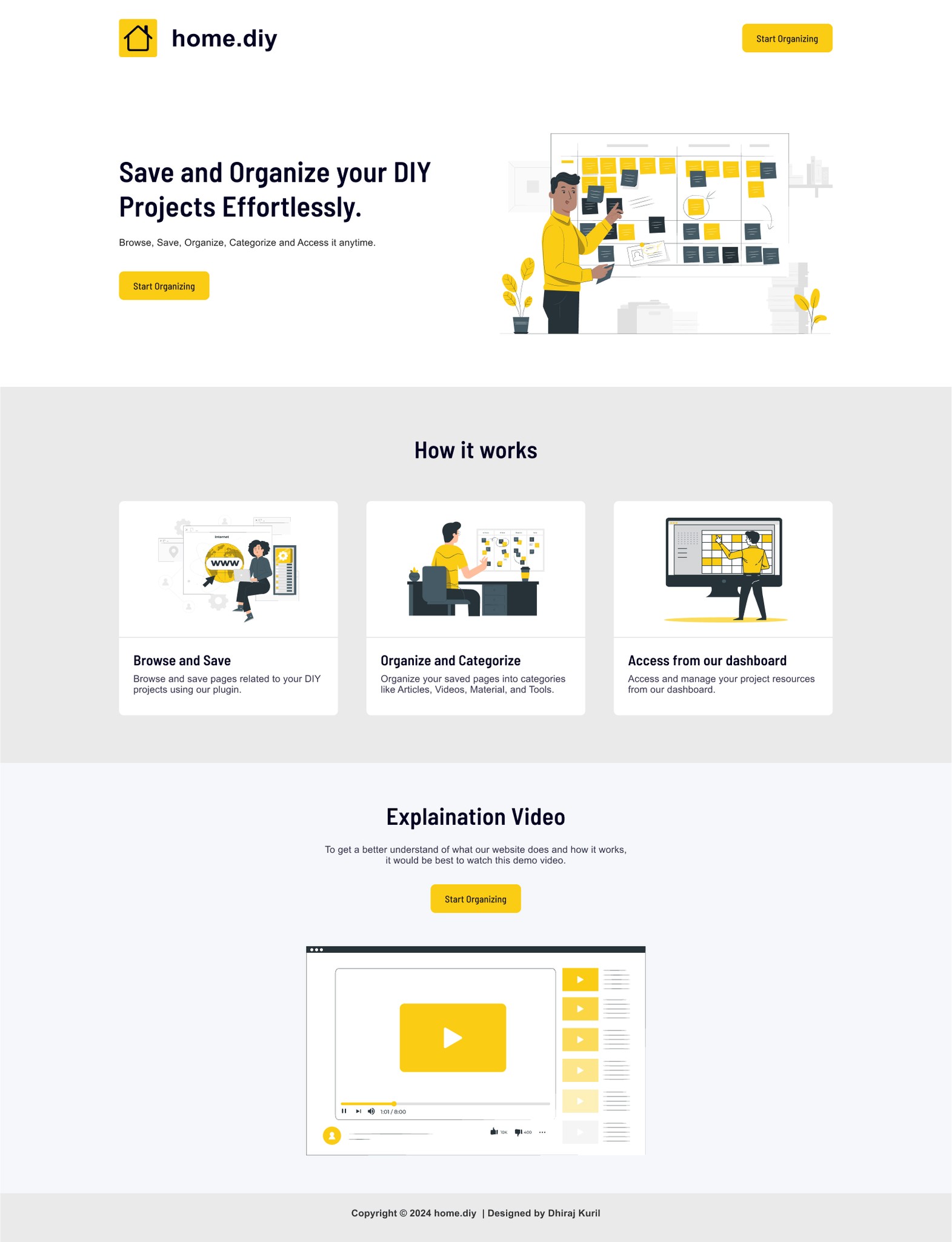
In terms of landing page they told me they want new landing page design that better reflects what their tool does. They also want to get rid of the "search" on the landing page (that they have in their existing one which even doesn't make sense) and replace it with something that will better explain what their website does so that they can convert signups.
Design Impact
Project Page
Redesigned the product page to streamline the user journey, enhancing readability, reducing friction points, and optimizing call-to-action placements for a more intuitive shopping experience.
Chrome Extension
Revamped the Chrome extension interface to improve usability and accessibility, making navigation more intuitive and key features more visible, enhancing overall user engagement.
Landing Page
Redesigned the landing page to better reflect the core functionality of the tool by removing the ineffective 'search' feature and replacing it with clear, concise messaging and visuals that explain the website’s purpose, effectively guiding users to sign up and engage with the platform.
This version highlights how the redesign directly addressed the need for clearer communication of the tool’s value and aimed at increasing user sign-ups.